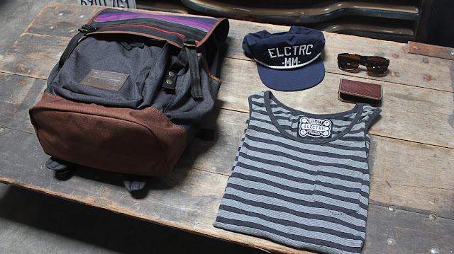
Earlier this year Electric decided to revamp their brand and go through the monstrous process of changing all their stationary. The resulting rebrand was all over the recent design trend of hipster branding like an ironic suit. This week we thought it would be a good idea to hipsterise a bunch of other snowboard brands...
After over twelve years in the action sports market, Electric is refreshing its brand with a newly designed logo, strategy and products. The sophistication of Electric’s products, influences, goals and interests developed alongside the rapidly evolving market, highlighting the need to refresh the company’s image in order to accurately represent the brand. Eric Crane, who designed the original Electric identity in 2000, is leading the new identity project. The new “VOLT” logo, photography style and brand design celebrates Electric’s Southern California roots with an emphasis on premium quality and timeless style.
So they're going to charge more and to justify the additional costs they'll be providing nicer packaging. Here's the change...
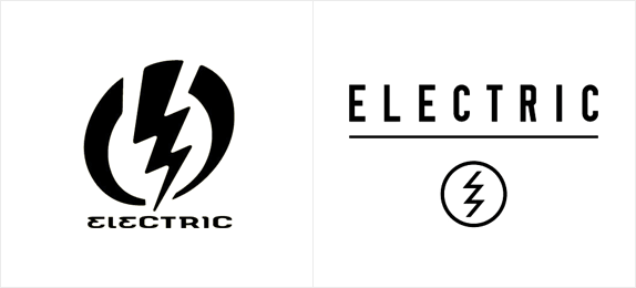
Granted the old wordmark (the writing bit) was a bit shit, but the old logo was really strong and instantly recognisable. In comparison the new one, which follows the ultra-minimalist and extremely-literal hipster aesthetic, is just a bit forgettable.
Here's a small bit from a recent Transworld Business interview with Eric Crane explaining how you get the hipster look:
What went into designing the new logo? Inspiration, historical connections for the brand, ties to the industry/market?
The new logo process was really collaborative and thorough. I worked with several designers, as well as our creative director Jack Bailey and co-founder Kip Arnette. We wanted to retain the gesture of the Volt, but distill it down to is primal essence and meaning. The cleaner version is much more conducive to communicating the brand vision and looks amazing on product.
Describe Electric’s new vibe in three words:
Timeless, sophisticated, powerful
That's clear enough then, and now we know how to do it, lets give it a shot with some other snowboard brands...
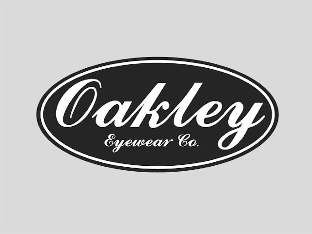
What do you think? Should these guys or any other companies jump on the hipster branding bandwagon? Surprisingly for something that took all of ten minutes to come up with, I think the Quiksilver one might actually be an improvement on the real thing.
You Might Also Like...
See where Electric and PPR fit into our infographic on The Faceless Corporations That Run Snowboarding
Hipster Snowboarding Dad
Electric was acquired along with their parent company Volcom for $608 million in 2011 by the French luxury retail conglomerate PPR. Two years later here's what they had to say about the re-brand in their press release:
So they're going to charge more and to justify the additional costs they'll be providing nicer packaging. Here's the change...
Granted the old wordmark (the writing bit) was a bit shit, but the old logo was really strong and instantly recognisable. In comparison the new one, which follows the ultra-minimalist and extremely-literal hipster aesthetic, is just a bit forgettable.
Here's a small bit from a recent Transworld Business interview with Eric Crane explaining how you get the hipster look:
What went into designing the new logo? Inspiration, historical connections for the brand, ties to the industry/market?
The new logo process was really collaborative and thorough. I worked with several designers, as well as our creative director Jack Bailey and co-founder Kip Arnette. We wanted to retain the gesture of the Volt, but distill it down to is primal essence and meaning. The cleaner version is much more conducive to communicating the brand vision and looks amazing on product.
 |
| Hipster product |
Describe Electric’s new vibe in three words:
Timeless, sophisticated, powerful
That's clear enough then, and now we know how to do it, lets give it a shot with some other snowboard brands...
What do you think? Should these guys or any other companies jump on the hipster branding bandwagon? Surprisingly for something that took all of ten minutes to come up with, I think the Quiksilver one might actually be an improvement on the real thing.
You Might Also Like...
See where Electric and PPR fit into our infographic on The Faceless Corporations That Run Snowboarding
Hipster Snowboarding Dad


